
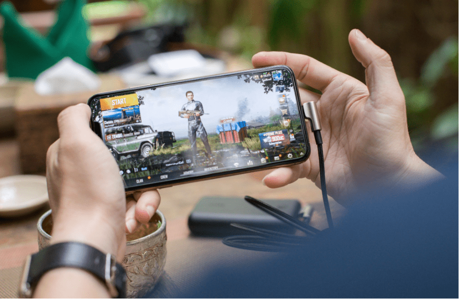
Screens have gotten smaller while the data they need to display has only grown more complex. For gaming platforms, this creates a real design problem: dashboards built around odds, stats, live scores, user balances, and real-time notifications cannot simply be scaled down. They need to be rethought entirely. The shift to mobile-first design is no longer a trend; it is the standard that separates functional gaming products from frustrating ones.
Pexels.com
Mobile Optimization as the Key Aspect of Gaming Culture
Mobile optimization has become one of the defining aspects of modern gaming culture. The reasons are straightforward: the majority of users now access gaming platforms, sports tools, and interactive entertainment through their phones. This is not a preference; it is a behavioral shift that has reshaped how products are built from the ground up. Developers who design for desktop first and adapt for mobile later consistently produce inferior mobile experiences. The ones leading the market today do the opposite.
The practical implications are significant. A mobile-first approach forces designers to prioritize only the most essential information and interactions. Navigation has to be thumb-friendly. Load times have to be fast on cellular connections. Data-heavy tables and dashboards need to collapse cleanly without losing meaning. These constraints, rather than limiting the product, usually result in a cleaner, more focused experience across all devices.
Minecraft is a clear example of how mobile availability can transform a game’s reach and cultural footprint. Originally built for PC, its release on iOS and Android opened it to an entirely new generation of players who might never have sat at a desktop to play it. The ability to build, explore, and create from anywhere, on a commute, during a lunch break, or in bed, made the game part of daily life in a way that a desktop-only version never could. Mobile accessibility did not just expand its audience; it changed how deeply embedded the game became in popular culture.
Even gaming genres such as casino gaming, which used to be tied to desktop screens, have now moved to mobile gaming almost wholly. For this reason, if we observe the overall process of evaluating internet gambling platforms for overall safety, we will be able to see that all reliable evaluations also consider mobile gaming as an aspect that affects the final grade. A platform that performs poorly on mobile (slow load times, broken interfaces, or missing features) scores lower overall, regardless of how polished its desktop version may be.
Battle royale games like PUBG Mobile offer another strong example outside the casino space. The mobile version of PUBG was engineered specifically for touchscreens, with adjusted controls, scaled maps, and shorter session formats that matched how mobile users actually play. It became one of the highest-grossing mobile games globally, generating hundreds of millions of dollars in revenue and building a competitive scene of its own. Its success came from treating mobile as a primary platform rather than a secondary port.
These examples across very different gaming categories have sent a clear message to studios and gaming brands: mobile layout optimization is worth serious investment. Teams are now dedicating specific resources to mobile UX research, touchscreen interface testing, and adaptive design systems. The brands that commit to this process consistently outperform those that treat mobile as an afterthought.
The Core Challenges of Displaying Complex Data on Small Screens
Gaming platforms often carry some of the most data-dense interfaces on the web. A single sports betting dashboard, for example, might display dozens of live markets, shifting odds, multiple game clocks, user balance information, and promotional banners, all simultaneously. On a desktop, this is manageable. On a 6-inch screen, it becomes a genuine design challenge that requires deliberate solutions rather than simple resizing.
The most common approach is progressive disclosure: showing users a condensed view by default and revealing additional data on demand. A live odds table might initially display just the top two or three options for a given event, with a tap expanding the full market. This keeps the screen readable without removing information entirely. The user stays in control of the depth they engage with, which also improves session quality by not overwhelming them on entry.
Typography and spacing play a bigger role on mobile than most non-designers expect. Small screens amplify any inconsistency in font sizing or line spacing, making cluttered layouts feel chaotic very quickly. Mobile-first design teams typically establish strict typographic hierarchies early in the process (primary data in larger, bolder type, secondary data in muted or smaller type) so users can scan rapidly and locate what they need without reading everything on the screen.
Navigation Architecture Built Around Thumbs, Not Cursors
Desktop navigation is built around a cursor that can hover over elements, click small targets precisely, and access dropdown menus with ease. Mobile navigation operates under entirely different physical constraints.
Thumbs have limited reach on a screen, and touch targets that are too small or too close together cause constant misclicks, which destroy the user experience and drive people away from the platform.
The most effective mobile gaming layouts anchor their primary navigation at the bottom of the screen, within easy reach of the thumb. Secondary actions live higher up and are accessed less frequently. This mirrors patterns established by major apps across social media, streaming, and e-commerce: patterns that users have already internalized, meaning the learning curve for a well-designed gaming app is minimal.
Gesture-based navigation is another layer worth considering. Swiping between live events, pulling down to refresh odds, or long-pressing to save a selection are all gestures that feel natural on mobile and can significantly reduce the number of taps required to complete a core action.
Platforms that incorporate these interactions thoughtfully create a sense of fluidity that purely button-based navigation cannot match. The best mobile gaming products feel fast not just because they load quickly, but because the path from intent to action is short.
Performance Optimization and Its Direct Impact on Retention
Interface design only matters if the interface actually loads. Mobile users on cellular connections are less tolerant of slow load times than desktop users, and gaming platforms that rely on heavy JavaScript frameworks, uncompressed images, or unoptimized data calls pay for it in bounce rates and abandonment. Performance is part of the design, not a separate engineering concern.
Modern mobile-first builds typically use lazy loading to defer non-critical content until it is needed, reducing the initial payload the user’s device has to process. Images are served in next-generation formats and sized dynamically based on screen resolution.
Caching strategies also matter. A user returning to a platform should not have to reload every element from scratch on each visit. Intelligent caching stores static assets locally so the interface rebuilds quickly, with only live data needing a fresh fetch. This makes the experience feel responsive and reliable, which directly supports the trust users place in a platform. In competitive spaces where multiple products offer similar content, speed and reliability often determine which one earns long-term loyalty.
The investment required to build and maintain a truly optimized mobile experience is real, but so is the return. Gaming platforms that take mobile design seriously see longer session times, higher conversion rates, and stronger user retention.
The small screen is where most users are, and meeting them there with a product that actually works well is no longer optional. It is the baseline expectation, and raising the quality above that baseline is where genuine competitive advantage is built.




 SuBZeRO2K
 Spotify
 Anchor
 iTunes